In 2025, the world of graphic design continues to evolve, with color contrast remaining a cornerstone of effective visual communication. Whether you’re a seasoned designer or just starting, understanding this principle can elevate your designs and captivate audiences. Let’s explore this timeless concept and how it aligns with current trends.
Why Color Contrast Matters in Design
Color contrast is more than just a visual tool; it’s an essential part of creating harmony and clarity in design. Here’s why it’s so crucial:
- Grabbing Attention: Effective contrast naturally draws the eye, guiding viewers to key elements in a design. Subtle and harmonious contrasts can enhance the visual experience, while poorly executed contrast can overwhelm or repel.
- Enhancing Meaning: Colors carry emotional and psychological weight. When used correctly, contrast reinforces your message, making it more impactful and memorable.
- Establishing Hierarchy: Through contrast, designers can create focal points and guide the viewer’s journey through the content. This silent yet powerful method helps emphasize important elements without overwhelming the overall design.
Finding the right balance is critical—too much contrast can feel chaotic, while too little can make a design feel bland. Striking the perfect balance ensures your designs are both engaging and effective.
Josef Albers’ Theory of Color Interaction
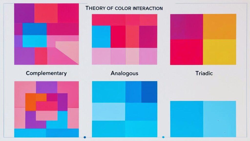
Josef Albers, a renowned German-American artist and educator, offered groundbreaking insights into how colors interact with one another. His work focused on the relativity of color and how context influences perception. Below is an overview of his key ideas:
- Color Relativity:
- Albers emphasized that the perception of a color is not fixed but depends on its surroundings. For instance, a single color can appear different depending on the colors adjacent to it.
- Illusion of Transparency:
- Through his famous “Homage to the Square” series, Albers illustrated how overlapping colors can create the illusion of transparency or depth, adding dimensionality to flat compositions.
- Simultaneous Contrast:
- Similar to Itten, Albers explored how colors placed side by side influence each other’s intensity, often resulting in unexpected visual effects.
- The Interaction of Warm and Cool Colors:
- Albers believed that warm and cool colors could shift dramatically based on their context, creating dynamic visual tensions in design.
- Practical Exercises:
- In his teaching, Albers encouraged students to experiment with cut paper to observe firsthand how color behaves. This hands-on approach remains a valuable method for understanding color interaction.
Albers’ philosophy underscores that color is a relative phenomenon, shaped by human perception and environmental context. Integrating his ideas into your designs can lead to a deeper appreciation for the subtle interplay of color.
Applying Color Contrast in 2025 Design Trends
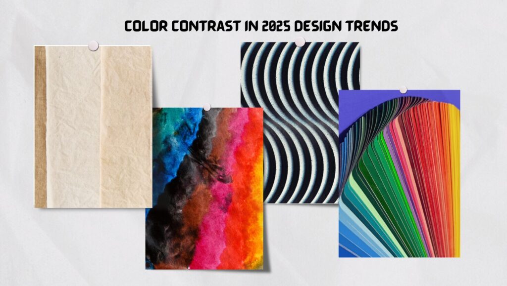
Modern design trends demand innovative approaches to color contrast. Here’s how to stay ahead of the curve:
- Neutral Tones with Bold Accents:
- Pairing earthy, muted tones with vibrant highlights creates a modern aesthetic that resonates with diverse audiences.
- Gradient Transitions:
- Smooth color gradients offer depth and dimension, aligning with futuristic and dynamic themes.
- Minimalist Vibrancy:
- Contrast sparingly in minimalist designs to emphasize key elements while maintaining simplicity.
- Eco-Conscious Palettes:
- Use colors inspired by nature, such as ocean blues and forest greens, with contrasting citrus tones to reflect sustainability and harmony.
Updated Resources for 2025
Stay informed with these expert resources for mastering color contrast:
- Smashing Magazine – “Mastering Color Theory for the Modern Designer” (2025).
- Adobe Blog– “Color Trends and Their Impact on Visual Communication” (2025).
- Canva Design School – “Navigating Contrast: A Designer’s Guide” (2025).
- 99designs – “Top Design Trends for 2025” (2025).
- Creative Bloq – “The Psychology of Color in Design” (2025).
- Envato Tuts+ – “From Theory to Practice: Using Color Effectively” (2025).
By mastering color contrast, you’ll unlock new creative possibilities and ensure your designs are both impactful and timeless. Ready to elevate your work? Dive deeper into these techniques and watch your designs flourish!
PariPixel Studio – Turning ideas into visuals that captivate!

Your article helped me a lot, is there any more related content? Thanks!
I don’t think the title of your article matches the content lol. Just kidding, mainly because I had some doubts after reading the article.
Your article helped me a lot, is there any more related content? Thanks!
I don’t think the title of your article matches the content lol. Just kidding, mainly because I had some doubts after reading the article.