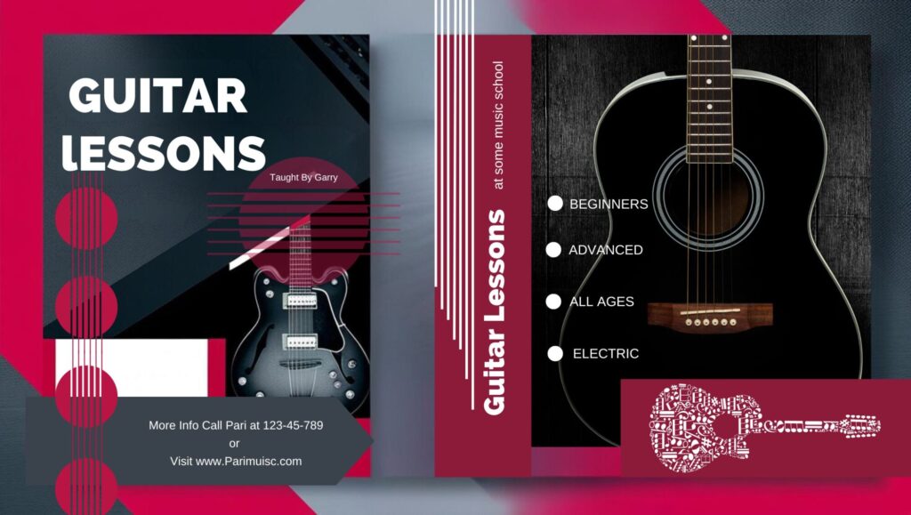
Graphic design is more than just creating beautiful visuals; it’s about guiding the viewer’s attention in a way that conveys the intended message effectively. Two fundamental visual patterns that dominate design layouts are the Z-pattern and the F-pattern. Understanding these patterns can transform your designs, making them more engaging and user-friendly.
At PariPixel, we believe in crafting intuitive designs that resonate with the audience. By using Z-pattern and F-pattern layouts, you can create designs that not only look great but also communicate effectively.
This blog explores these patterns, their applications in web and print design, and resources to help you master Z-pattern and F-pattern layouts. Whether you’re designing posters, web pages, or user interfaces, these principles can help you elevate your work to the next level.
The Power of the Z-Pattern
The Z-pattern layout is a dynamic and natural visual flow that mimics how our eyes move across a page, starting at the top-left corner, scanning diagonally, and landing at the bottom-right. The Z-pattern mimics the natural eye movement when scanning a design. It starts at the top-left, moves to the top-right, diagonally down to the bottom-left, and finishes at the bottom-right. This pattern works exceptionally well for layouts with minimal content, like posters, banners, and landing pages.This pattern works exceptionally well in:
- Posters and Flyers: Highlight key messages, imagery, and calls to action in sequence.
- Web Pages: Showcase hero sections, benefits, and CTAs (Calls to Action).
- Advertisements: Direct attention to the most critical elements of a message.
By strategically placing high-impact elements (such as headlines, imagery, and CTAs) along this path, designers can create layouts that grab attention, communicate effectively, and drive action.
Applications:
- Advertisements
- Website hero sections
- Brochures
The F-Pattern: Optimized for Content-Heavy Designs

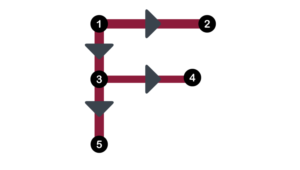
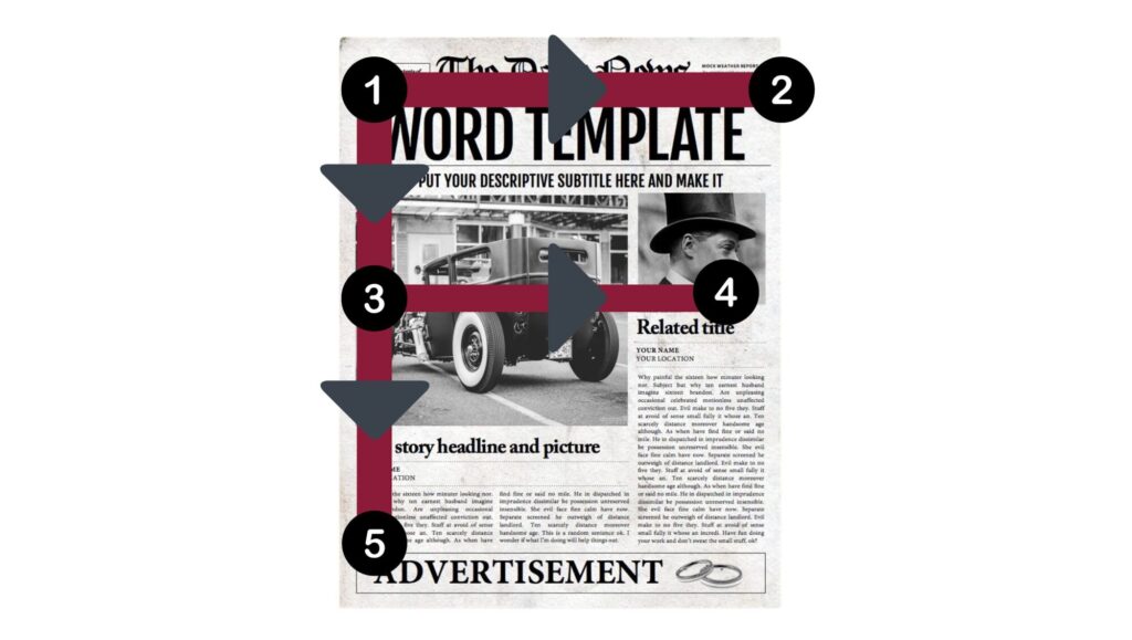
The F-pattern reflects how users typically scan text-heavy designs, focusing on the left side and scanning horizontally across the top. This pattern is common in blogs, articles, and websites with abundant textual information.
The Magic of the F-Pattern
The F-pattern layout aligns with how readers scan text-heavy content, such as blogs or articles. It involves starting at the top-left, moving horizontally across headings, then scanning down the left margin. This format thrives in:
- Web Articles: Prioritize key information in headlines and subheadings.
- UX/UI Design: Enhance usability for forms, menus, and content-heavy pages.
- Emails: Lead readers to essential links and calls to action.
By placing essential content along the horizontal and vertical axes, the F-pattern ensures effortless readability and information hierarchy.

- Blogs
- News websites
- E-commerce product listings
Z vs. F Pattern: When to Use Them
- Use the Z-pattern for designs with minimal text and strong visuals.
- Use the F-pattern for content-rich layouts where text is the primary focus.
Design Resources for Z and F Patterns
Here are some resources to deepen your understanding and improve your designs:
- Smashing Magazine – The Z-Pattern Layout: Examples And Best Practices
- Interaction Design Foundation – Visual Hierarchy and the F-Pattern
- Canva Design School – Graphic Design Layout Tips
- PariPixel – Explore Creative Design Trends
Final Thoughts
Graphic design isn’t just about aesthetics—it’s about strategic visual storytelling. By integrating the Z and F patterns into your designs, you can create layouts that not only look great but also communicate effectively.
PariPixel Studio – Turning ideas into visuals that captivate!


Your article helped me a lot, is there any more related content? Thanks!
Thank you for your sharing. I am worried that I lack creative ideas. It is your article that makes me full of hope. Thank you. But, I have a question, can you help me?