What Is the Golden Ratio? Ever wonder why some visuals just feel right? The reason might lie in an ancient number that has influenced design for centuries — the Golden Ratio.
Also known as phi (Φ), the Golden Ratio is approximately 1.618 and has been used in nature, art, architecture, and design to create visually harmonious compositions.
Let’s break it down and see how you can use this timeless principle to bring elegance and balance into your own design work.
What Is the Golden Ratio?
The Golden Ratio is a special mathematical proportion:
𝑎+𝑏/a=a/b=φ≈1.618
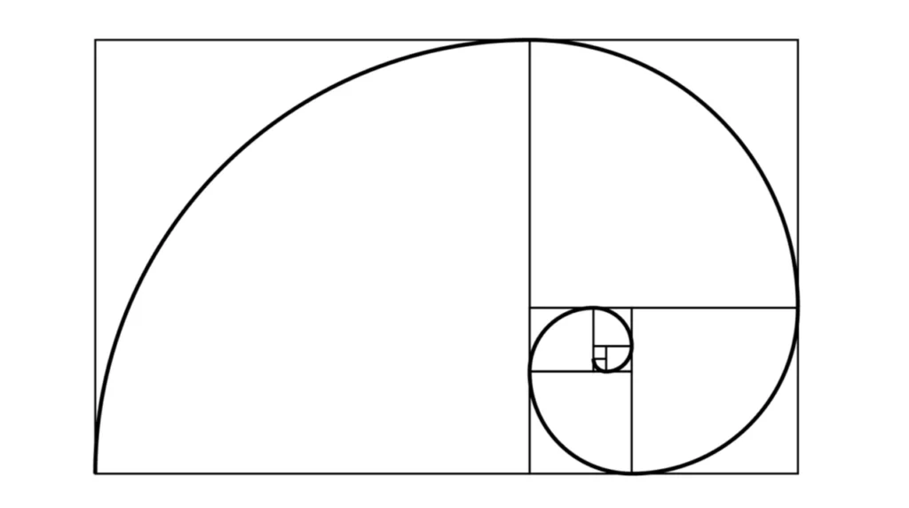
If you divide a line into two parts so that the ratio of the whole to the longer part is the same as the ratio of the longer part to the shorter — you get the Golden Ratio.
This ratio has a self-replicating property, meaning it can be scaled and repeated endlessly — ideal for structured, beautiful design.
Golden Ratio & Fibonacci Sequence
The Golden Ratio is closely tied to the Fibonacci sequence (0, 1, 1, 2, 3, 5, 8, 13…), where each number is the sum of the two before it. As the sequence progresses, the ratio between each number and the one before it approaches 1.618 — the Golden Ratio.
This connection makes the Golden Ratio feel organic and natural, as it’s found in the growth patterns of plants, seashells, and galaxies.
Why the Golden Ratio Matters in Design
Resource – mockplus.com
Designers from Leonardo da Vinci to Le Corbusier used the Golden Ratio to structure masterpieces. Here’s why it’s still relevant today:
- ✅ Visual Harmony: The Golden Ratio creates balance and proportion that feels instinctively pleasing.
- 🎯 Focal Points: Helps position key elements in your layout where the eye naturally travels.
- 🧭 User Experience: In web/UI design, it guides layout decisions for better flow and engagement.
- 🧠 Brand Recall: Designs that follow this ratio tend to be more memorable.
Practical Design Uses for the Golden Ratio
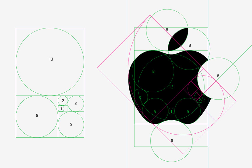
- Logo Design
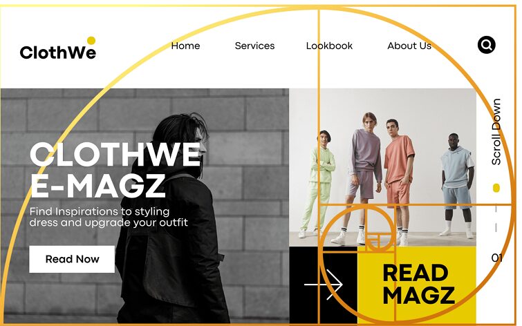
Use spirals and golden rectangles to form symbols that feel naturally balanced (think: Apple, Twitter). - Layout Grids
Divide your canvas using a 1:1.618 ratio to guide where text, images, or call-to-actions should go. - Typography
Use it to determine harmonious type scales. E.g., if your body text is 16px, your heading might be 16 × 1.618 ≈ 26px. - Photography
Align your subjects along a “Golden Spiral” for impactful compositions.
Tools & Resources
Want to start applying the Golden Ratio today? Try these free tools:
- 🔢 Golden Ratio Calculator
Quickly calculate ratios based on any number. - 🌀 PhiMatrix Overlay Tool
Add golden grids over your designs in Photoshop or Illustrator. - 🔠 GRT Typography Calculator
Set perfect font sizes and line heights using the ratio. - 📖 Canva’s Guide to the Golden Ratio
A great visual explainer for designers at any level.
A Few Cautions
While powerful, the Golden Ratio isn’t a magic formula. Be mindful of these:
- It’s a tool, not a rule — use it for guidance, not rigidity.
- Overuse can limit creativity if it forces you to always follow the same structure.
- Not universally appealing — beauty can be subjective and cultural.
Final Thoughts
From sunflowers to stock charts, the Golden Ratio appears everywhere — and when you use it intentionally, your designs can feel as effortlessly beautiful as nature itself.
At Pari Pixel, we use this timeless principle to bring balance and elegance to:
- Brand identities
- Social media layouts
- Posters and presentations
- UI/UX wireframes
Explore how we apply the Golden Ratio in real projects:
👉 Behance Portfolio
Want your brand or layout designed with this visual magic?
Let’s chat: @pari_pixel on Instagram
👉 For more tips and resources, stay connected with us at PARIPIXEL.COM.

Hello very nice blog!! Guy .. Beautiful .. Wonderful .. I will bookmark your website and take the feeds additionally…I’m satisfied to search out so many useful info here within the publish, we need develop extra strategies on this regard, thanks for sharing.
Can you be more specific about the content of your article? After reading it, I still have some doubts. Hope you can help me.
I don’t think the title of your article matches the content lol. Just kidding, mainly because I had some doubts after reading the article.
Thanks for sharing. I read many of your blog posts, cool, your blog is very good.
Thank you for your sharing. I am worried that I lack creative ideas. It is your article that makes me full of hope. Thank you. But, I have a question, can you help me?