As we move into 2026, graphic layout and hierarchy are evolving beyond grids and rules. Designers are rethinking how information flows, how attention is guided, and how emotion plays a role in structure. Layouts are no longer just about alignment—they’re about experience, motion, and meaning.
Here’s what we can expect in graphic layout and hierarchy design in 2026.
1️⃣ Dynamic & Adaptive Layouts
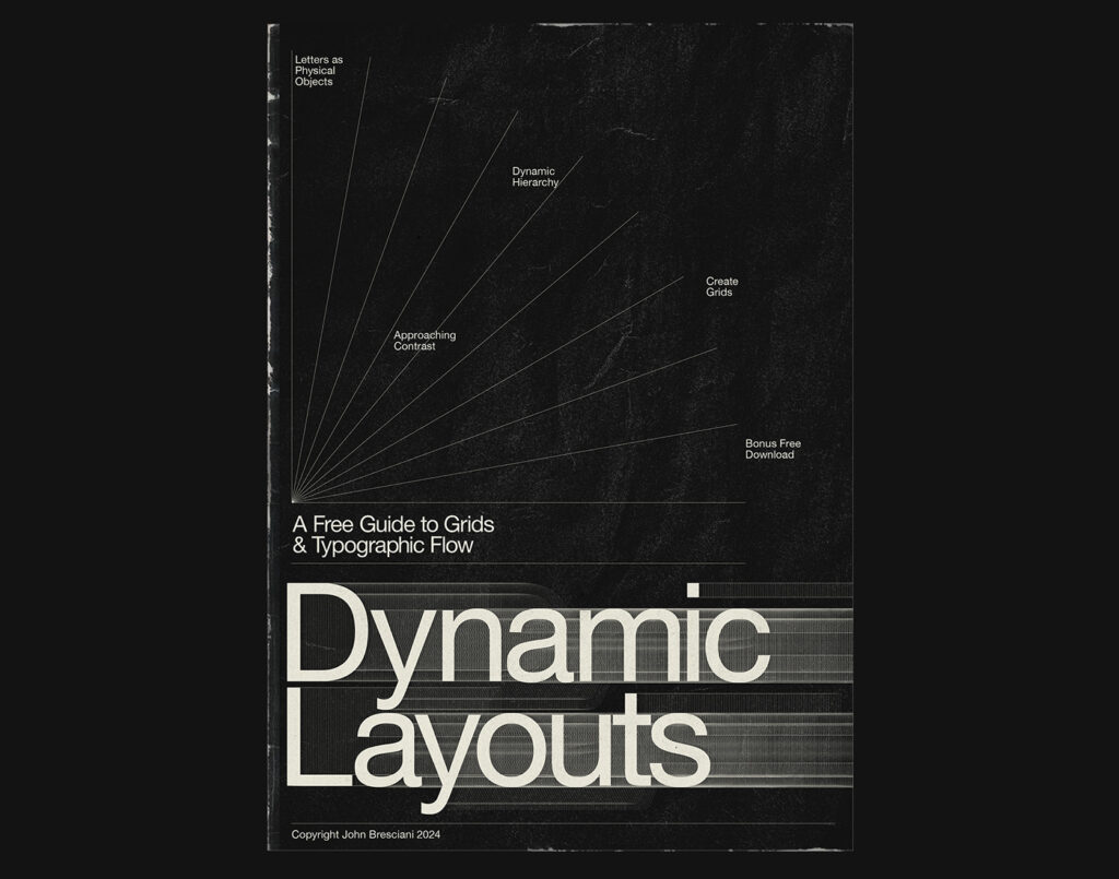
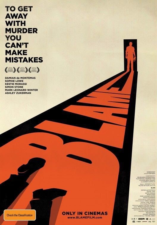
@behance
In 2026, layouts won’t stay fixed. They will adapt in real time based on screen size, user behavior, and context.
What this looks like:
- Content rearranges itself depending on scroll behavior
- Layouts shift subtly for mobile vs desktop
- Personalized hierarchy based on user interest
Why it matters:
Design becomes more intuitive and user-centric, improving engagement and readability.
2️⃣ Broken Grids with Intent
Traditional grid systems aren’t disappearing—but they’re being intentionally disrupted.
Expect to see:
- Overlapping elements
- Asymmetrical spacing
- Unexpected focal points
Designers will still rely on structure—but bend it creatively to create tension and visual interest.
3️⃣ Visual Hierarchy Driven by Emotion, Not Size
In 2026, hierarchy won’t rely only on font size or boldness. Instead, designers will use emotion-based cues.
New hierarchy tools:
- Color contrast to guide attention
- Motion to highlight importance
- Texture and depth to signal priority
Example:
A subtle animated element may draw more attention than a large static headline.
4️⃣ Typography-Led Layouts
Typography will increasingly define the layout itself, rather than fitting into it.
Key trends:
- Oversized headlines as layout anchors
- Variable fonts adjusting weight and width dynamically
- Text flowing freely across sections
Typography becomes the primary visual hierarchy, especially in editorial, branding, and landing pages.
5️⃣ Layered Depth & Visual Stacking
Flat design evolves into layered composition.
Expect:
- Foreground, midground, and background separation
- Soft shadows and blurred depth
- Floating cards and modular sections
This creates a natural hierarchy where the eye moves through layers instead of scanning blocks.
6️⃣ Motion as a Hierarchy Tool
Motion will replace arrows, lines, and boxes as a way to guide users.
Examples:
- Headlines fading in first
- Secondary text appearing on scroll
- CTAs pulsing subtly
Motion adds clarity without clutter.
7️⃣ Minimal Content, Strong Focus
Instead of overcrowded layouts, 2026 favors less content per screen with clearer priority.
Layout characteristics:
- More white space
- One main message per section
- Clear reading paths
This approach respects shorter attention spans and mobile-first consumption.
8️⃣ Human-Centered & Imperfect Composition
Layouts will feel less mechanical and more organic.
Designers will use:
- Hand-drawn dividers
- Uneven margins
- Organic spacing
These imperfections create warmth and authenticity, standing out in a world of AI-perfect layouts.
✨ What This Means for Designers in 2026
| Aspect | Shift |
|---|---|
| Layout | From static to adaptive |
| Hierarchy | From size-based to emotion-based |
| Structure | From strict grids to flexible systems |
| Focus | From content-heavy to clarity-driven |
| Experience | From visual to interactive |
🚀 Final Thoughts
Graphic layout and hierarchy in 2026 will be about guiding attention naturally, not forcing it. Designers who understand flow, emotion, and user behavior will lead the next wave of visual communication.
Layouts won’t just organize content—they’ll tell stories, respond to users, and create memorable experiences.
👉 Ready to design your brand identity? Explore our services at PariPixel.com

best cannabis edibles 2025 crafted for global markets