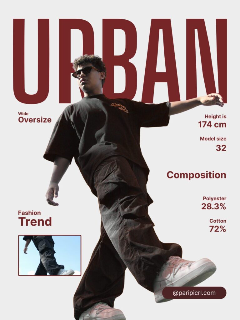
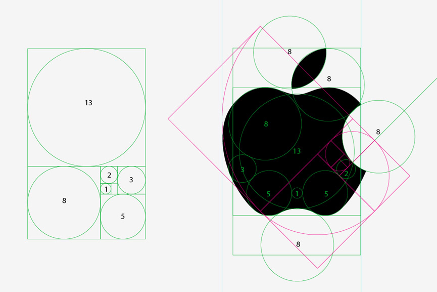
Layout & Composition: It is to guide the viewer’s eye. Layout and composition are the invisible forces behind every great design. They determine how visual elements are arranged to create order, flow, and clarity. A strong layout guides the viewer’s eye naturally, helping them understand information without effort.
At PariPixel, we treat layout as a visual strategy—not just arrangement, but intention.
What Is Layout & Composition?
Layout refers to the structure of a design, while composition is how elements interact within that structure. Together, they control how users scan, process, and engage with content.
A well-designed layout doesn’t shout for attention—it quietly leads the viewer from one element to the next.
Key Layout Principles Explained
1. Visual Hierarchy: Showing What Matters Most
Visual hierarchy determines what users notice first, second, and last. It helps prioritize information by using:
- Size and scale
- Contrast
- Color emphasis
- Positioning
- Typography weight
Strong hierarchy ensures important messages stand out while supporting content remains accessible.
Example: Headlines appear larger and bolder than body text, guiding the reader naturally through content.

Web layout showing clear headline hierarchy, subheadings, and body text, strong contrast, clean modern design.
2. Alignment: Creating Order and Professionalism
Alignment brings visual harmony by connecting elements along common edges or axes.
Good alignment:
- Improves readability
- Creates visual balance
- Makes designs feel polished and intentional
Misaligned elements instantly make a design feel chaotic or unprofessional.
Design Tip: Even creative layouts benefit from invisible alignment rules.

Clean editorial layout with perfectly aligned text and images, modern grid-based design, minimal style.
3. Grids: The Backbone of Consistency
Grids provide structure and consistency across designs. They help designers maintain rhythm while allowing creative flexibility.
Grids are essential for:
- Websites and apps
- Editorial layouts
- Social media templates
- Brand systems
A grid doesn’t restrict creativity—it supports it.

Website layout with visible grid lines, columns and margins highlighted, professional UI/UX design
4. Balance: Achieving Visual Stability
Balance refers to how visual weight is distributed in a design.
There are two main types:
- Symmetrical balance – Clean, formal, and stable
- Asymmetrical balance – Dynamic and modern
Balanced designs feel comfortable and visually pleasing, even when layouts are bold or experimental.
Design Tip: Balance isn’t about symmetry—it’s about visual weight.

Asymmetrical design layout with balanced text and images, modern creative composition, clean spacing
5. Proximity: Grouping Related Content
Proximity organizes information by grouping related elements together and separating unrelated ones.
Effective proximity:
- Improves clarity
- Reduces visual noise
- Makes content easier to scan
When items are placed close together, users instinctively understand they belong together.

UI layout showing grouped content cards with clear spacing, modern interface design, clean organization
Why Layout & Composition Are Critical
Strong layout design:
- Improves readability
- Reduces confusion
- Enhances professionalism
- Guides user attention
- Drives engagement and conversions
A layout that feels “right” keeps users focused. A poor layout pushes them away—often without them knowing why.
At PariPixel, we design layouts that work silently but powerfully behind the scenes.
Resources for Learning Layout & Composition
- Interaction Design Foundation – Visual Hierarchy
https://www.interaction-design.org/literature/topics/visual-hierarchy - Smashing Magazine – Grid Systems
https://www.smashingmagazine.com/category/layout/ - Canva Layout Design Guide
https://www.canva.com/learn/layout-design/
Final Thoughts
Great layout and composition make design feel effortless. They guide attention, clarify meaning, and create a seamless experience for the viewer.
When layout is done right, users don’t notice it—they simply enjoy the design.
At PariPixel, layout is not just structure. It’s how we turn ideas into intuitive, engaging visual experiences.
Ready to design your brand identity? Explore our services at PariPixel.com


