Colors and Emotions. Colors aren’t just visual—they’re emotional triggers that shape how we feel, think, and even make decisions. Imagine this: you’re standing on lush green grass by a calm blue lake under a bright sky. You probably feel relaxed, uplifted, and at peace.
Now flip the scene—what if the grass was purple, the sky turned red, and the water turned black? Suddenly, the mood shifts from calming to unsettling. That’s the power of color psychology.
At PariPixel, we believe understanding the emotional impact of color is essential for building memorable brands and designs. Recently, a global survey of over 2,200 entrepreneurs from 50+ countries revealed fascinating insights about how people perceive eight key colors. While some patterns were universal, others varied greatly by culture.
Let’s dive into how colors shape emotions—and how you can use them strategically in design and branding.
🎨 The Emotional Meaning of Colors
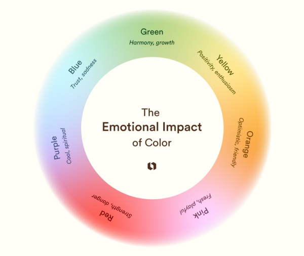
Here’s a quick breakdown of how different colors are commonly associated with emotions:
- Green → Harmony, nature, growth
- Purple → Calm, spiritual, cool
- Yellow → Positivity, happiness, enthusiasm
- Pink → Playful, youthful, feminine
- Blue → Trust, professionalism, loyalty (but also sadness)
- Orange → Friendly, warm, optimistic
- Red → Passion, love, strength, danger
These associations aren’t universal—they’re shaped by culture, language, and life experiences. But across industries, designers and brands have consistently leveraged color to evoke specific feelings.
🌍 How Do We Learn Color Associations?
From childhood, our environment and culture shape how we see colors. For instance:
- In North America, children often identify ducks as yellow because of illustrated books.
- In the Candoshi village of Peru, people don’t use words for colors at all—they compare shades to natural objects like fruits and flowers.
- In Papua New Guinea, the Dani language only has two color terms (dark and light), leading to a very different way of perceiving color compared to English speakers.
This shows how language + culture = emotional meaning of colors. Over time, we connect colors with feelings: cozy fall hues, festive reds, or calming beachy blues.
📖 Resource: Psychology of Color by Verywell Mind
🧠 The Impact of Color on Performance
Did you know colors can affect how well you perform? A study by the University of Rochester and the University of Munich found that seeing red before a test lowered students’ performance. Why? Because red ink is strongly tied to mistakes and failure in academics.
This proves that colors can unconsciously trigger emotions that influence behavior.
📖 Resource: How Colors Influence Performance – ScienceDaily
🏢 Colors in Branding and Marketing
Brands have long tapped into color psychology to create powerful identities:
- Yellow → Happiness & energy (McDonald’s, Cheerios, Bumble)
- Green → Nature & growth (Whole Foods, Rainforest Alliance, TD Bank)
- Blue → Trust & security (PayPal, BlueCross, Facebook)
- Black → Luxury & elegance (Chanel, Rolex, Bentley)
- Red → Passion & excitement (Netflix, Target, CNN)
Color choices aren’t random—they’re strategic. Whether you’re launching a startup or rebranding, understanding how color shapes perception can help you stand out.
📖 Resource: Color Psychology in Marketing by HubSpot
🎯 How Different Colors Influence Mood
Here’s what survey findings revealed about emotional triggers:
- Green → Fresh & Uplifting
Associated with nature, hope, and financial growth. No wonder banks and eco-brands love green. - Purple → Regal & Calm
Historically tied to royalty, wealth, and spirituality. Light purples evoke calmness, while dark shades signal power. - Yellow → Happiness & Optimism
Universally linked to sunshine, light, and joy. Food and lifestyle brands often use yellow to spark instant positivity. - Pink → Feminine & Youthful
Globally tied to femininity, playfulness, and charm. Think Barbie, Hello Kitty, and Breast Cancer Awareness. - Blue → Trust & Stability
A favorite in finance and healthcare for building confidence. Teal shades are especially calming, evoking ocean and sky imagery. - Orange → Warm & Friendly
A blend of red and yellow, orange radiates energy and approachability. Amazon and FedEx use it to spark trust and friendliness. - Red → Passion & Strength
Associated with love, excitement, and urgency. But it can also mean danger or anger, depending on context.
📖 Resource: 99Designs – Color Meanings and Psychology
🌟 Final Thoughts
While color associations are subjective and culture-specific, they’re undeniably powerful. Choosing the right color palette can make your brand feel more trustworthy, exciting, youthful, or luxurious.
At PariPixel, we specialize in helping businesses create stunning brand identities that connect emotionally with audiences. Whether it’s a logo, social media template, or full brand kit, we know how to use color psychology to make your brand unforgettable.
👉 Ready to design your brand identity? Explore our services at PariPixel.com
📖 Additional Resources to Explore:
- Canva – Color Meaning Guide
- Adobe Color Wheel
- Color Psychology: How Colors Impact Feelings & Behavior
✨ Pro tip: Next time you’re brainstorming your brand colors, don’t just pick what “looks good”—think about what your audience should feel.

Greetings! Very helpful advice on this article! It is the little changes that make the biggest changes. Thanks a lot for sharing!
Thank you for your sharing. I am worried that I lack creative ideas. It is your article that makes me full of hope. Thank you. But, I have a question, can you help me?
Your point of view caught my eye and was very interesting. Thanks. I have a question for you.
I don’t think the title of your article matches the content lol. Just kidding, mainly because I had some doubts after reading the article.
Thanks for sharing. I read many of your blog posts, cool, your blog is very good.