Design Layout Principles Every Designer Should Know. A beautifully designed layout isn’t just about aesthetics — it’s about clarity, flow, and function. Whether you’re designing a web page, poster, brochure, or social media post, understanding key layout principles can take your work from good to great.
Let’s break down the essential layout rules every modern designer should have in their toolkit — and how to use them effectively.
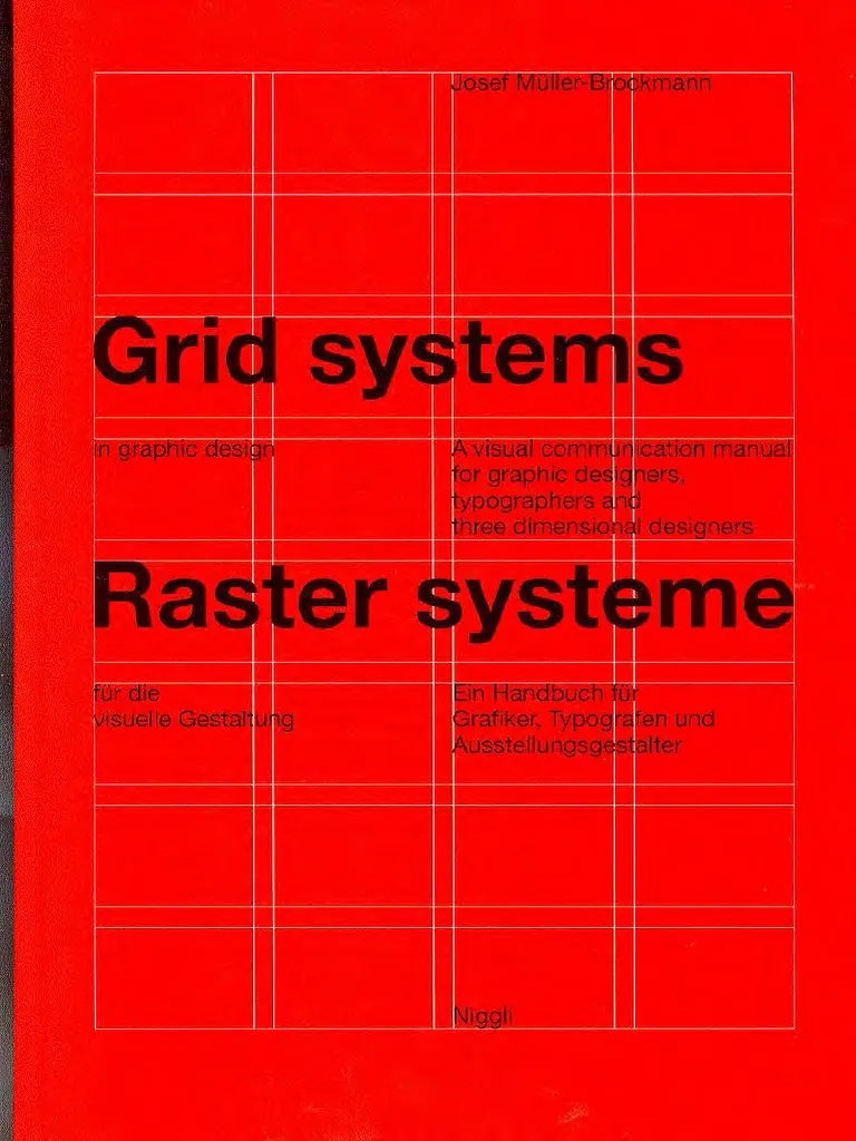
1. Grid Systems: The Foundation of Consistency
Resource-scribd.com
A grid is a framework that helps align and organize elements. It gives your design structure and rhythm.
Why it matters:
Grids ensure consistency, improve alignment, and speed up your workflow — especially in multi-page designs or responsive layouts.
Types of grids:
- Column Grid (common in web design)
- Modular Grid (used in magazines)
- Baseline Grid (for type alignment)
Tool to try:
2. Visual Hierarchy: Guide the Eye
Hierarchy is the order in which the eye processes information. A strong hierarchy tells the viewer what’s most important.
How to create hierarchy:
- Use size: Big headlines grab attention.
- Use contrast: Bold colors or weights stand out.
- Use spacing: White space makes elements breathe.
Tool to test layouts:
3. 🌀 The Golden Ratio & Rule of Thirds
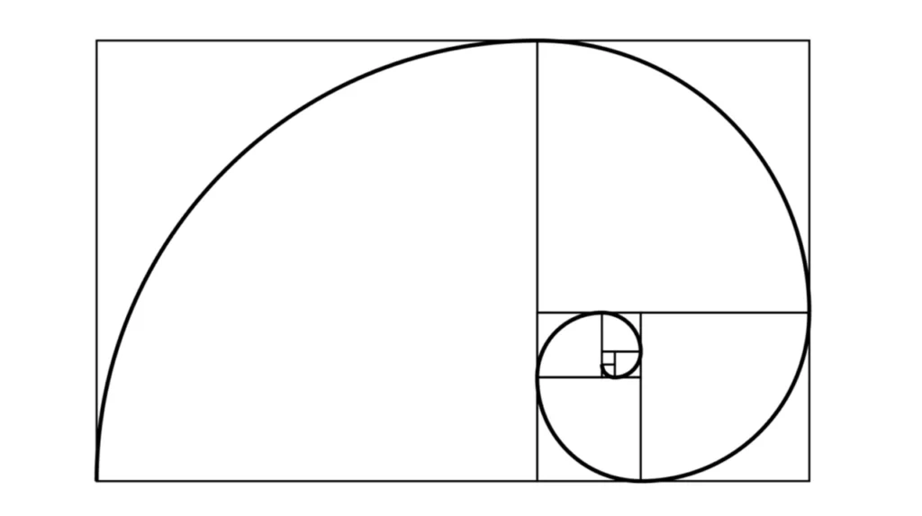
We’ve talked about the Golden Ratio, but let’s not forget its simpler cousin — the Rule of Thirds. Both help you place key elements in naturally appealing spots.
Golden Ratio: Use 1:1.618 proportions for layout divisions.
Rule of Thirds: Divide your frame into 3×3 grids and place focal points on intersections.
📘 Want to learn more? Read: What Is the Golden Ratio?
4. Alignment & Proximity: Keep It Clean
Alignment ensures all your elements have a visual connection.
Proximity groups similar items together.
These two principles create cohesion and prevent clutter. Don’t underestimate the power of well-aligned content!
💡 Tip: Use smart guides and snapping tools in Figma or Illustrator to make alignment effortless.
5. White Space: Let It Breathe
Also called “negative space”, white space isn’t empty — it’s essential. It improves readability, makes designs look high-end, and draws focus to key elements.
Use white space to:
- Separate text blocks
- Frame images
- Create minimalist, luxury layouts
🧠 Read: How White Space Makes Your Design More Effective
🎯 Final Tips for Layout Success
✅ Sketch before jumping into software
✅ Always zoom out to see your full composition
✅ Check contrast & legibility at every size
✅ Keep a library of inspiration: Pinterest, Behance, Dribbble
💼 Real Projects by Pari Pixel
From pitch decks to luxury product layouts, we use these principles to deliver bold, high-impact designs that communicate clearly and beautifully.
Check out our work: Behance Portfolio
Follow our tips on Instagram @pari_pixel
Need a layout that sells, connects, or inspires?
Let’s collaborate — your vision, elevated through strategy and design.
👉 For more tips and resources, stay connected with us at PARIPIXEL.COM.

Hey there! I’ve been reading your website for a while now and finally got the courage to go ahead and give you a shout out from New Caney Tx! Just wanted to say keep up the excellent work!
Heya i am for the primary time here. I came across this board and I to find It truly useful & it helped me out much. I am hoping to present one thing back and help others like you aided me.
Hi my family member! I wish to say that this post is amazing, great written and include approximately all important infos. I would like to look extra posts like this .
Yay google is my world beater assisted me to find this outstanding website ! .
F*ckin’ amazing things here. I am very glad to see your article. Thanks a lot and i’m looking forward to contact you. Will you please drop me a mail?
This actually answered my downside, thank you!
I like what you guys are up too. Such clever work and reporting! Carry on the excellent works guys I have incorporated you guys to my blogroll. I think it will improve the value of my site 🙂
An attention-grabbing discussion is worth comment. I believe that it’s best to write more on this subject, it may not be a taboo topic however generally persons are not sufficient to speak on such topics. To the next. Cheers
Good day very nice web site!! Man .. Beautiful .. Amazing .. I will bookmark your web site and take the feeds also…I’m happy to seek out numerous helpful information right here in the post, we want work out extra strategies on this regard, thank you for sharing.
I haven’t checked in here for some time because I thought it was getting boring, but the last few posts are great quality so I guess I will add you back to my everyday bloglist. You deserve it my friend 🙂
Very interesting details you have remarked, thanks for putting up.
Howdy! This post could not be written any better! Reading this post reminds me of my previous room mate! He always kept chatting about this. I will forward this post to him. Fairly certain he will have a good read. Thanks for sharing!
I real delighted to find this website on bing, just what I was searching for : D besides bookmarked.
I’ve been browsing online more than 3 hours these days, but I by no means found any interesting article like yours. It?¦s beautiful value sufficient for me. In my view, if all web owners and bloggers made good content as you probably did, the web can be a lot more helpful than ever before.
I don’t think the title of your article matches the content lol. Just kidding, mainly because I had some doubts after reading the article.
I don’t think the title of your article matches the content lol. Just kidding, mainly because I had some doubts after reading the article.
Thank you for your sharing. I am worried that I lack creative ideas. It is your article that makes me full of hope. Thank you. But, I have a question, can you help me?
Can you be more specific about the content of your article? After reading it, I still have some doubts. Hope you can help me.
Thanks for sharing. I read many of your blog posts, cool, your blog is very good.