Typography is not just about choosing a pretty font. It’s the unsung hero of design, a silent orchestrator of emotions, and the backbone of communication. Imagine a world where every brand used Comic Sans. Terrifying, right? Typography is the reason your favourite brand feels trustworthy, a book feels classic, or a headline demands your attention. It’s not just an art form—it’s a superpower.
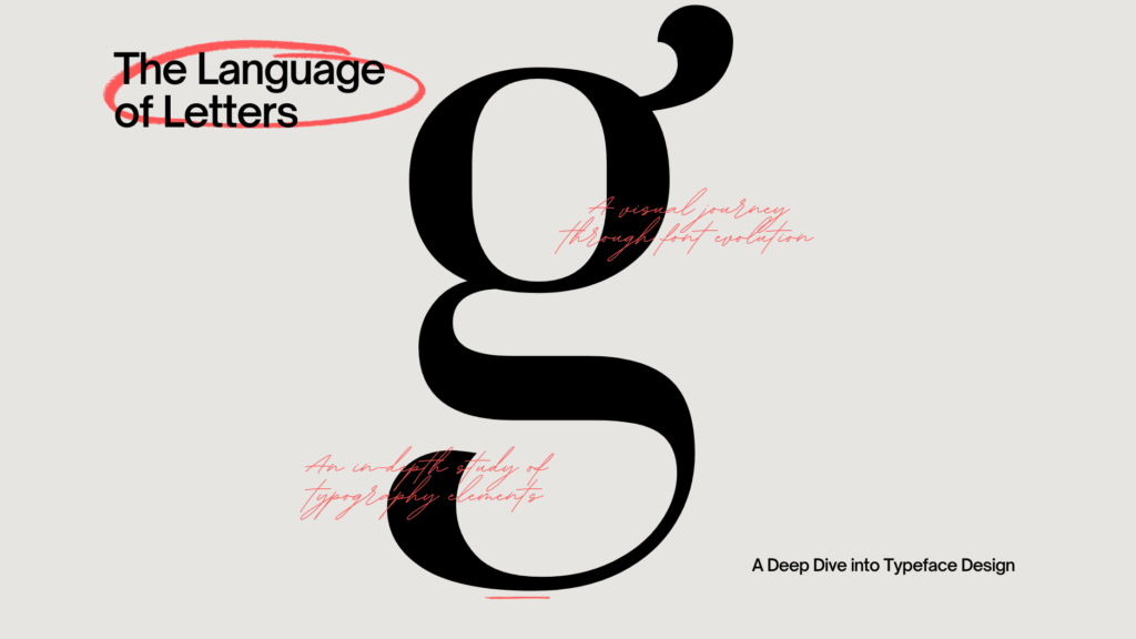
Typography Matters
Typography isn’t just for aesthetics; it’s functional. It helps convey the tone of a message, guides the reader’s eye, and can even influence emotions. Here’s why you need to stop underestimating it:
- First Impressions Matter
Your typography is your handshake in the digital world. A sloppy font choice is like showing up to a black-tie event in pajamas. - Guiding Reader Attention
Great typography acts like GPS for your reader. It directs attention to where you want it and ensures they don’t get lost in a sea of words. - Establishing Brand Identity
Fonts have personalities. A tech company might go for a sleek sans-serif font, while a luxury brand opts for elegant serifs. Typography makes brands instantly recognizable. - Enhancing Readability
If people can’t read it, they won’t buy it, click it, or trust it. Good typography ensures your message is crystal clear.
The Good, The Bad, and the Ugly of Typography
- The Good: Apple’s use of San Francisco font screams simplicity and innovation.
- The Bad: Papyrus in the “Avatar” movie logo—it’s iconic for all the wrong reasons.
- The Ugly: Comic Sans—so infamous that it’s practically a meme.
Tips for Better Typography
- Know Your Fonts
Serif fonts exude tradition and class (think Times New Roman). Sans-serif fonts are modern and clean (like Helvetica). Script fonts are playful and elegant, but use them sparingly unless you’re designing wedding invitations. - Pair Fonts Wisely
Typography is like dating. Some fonts go together, and some don’t. Use a maximum of two to three fonts in a design, and ensure they complement each other. - Hierarchy is Key
Headlines, subheadings, and body text need to stand apart. Use size, weight, and color to create a clear hierarchy. - White Space is Your Friend
Let your text breathe. Overcrowded designs are like awkward elevator rides—uncomfortable and forgettable.
Examples of Typography Done Right
- Coca-Cola: Their script font is timeless and instantly recognizable.
- Netflix: Clean sans-serif fonts align perfectly with their modern, digital-first brand.
- New York Times: Their serif font choices scream credibility and tradition.
Humor in Typography—Because Why Not?
Remember, typography is like coffee. When it’s done right, you don’t even notice it. When it’s bad, you’ll feel it immediately—like accidentally sipping decaf when you needed a caffeine jolt.
Resources to Explore Typography
- Google Fonts – Free, high-quality fonts for every need.
- Typewolf – A treasure trove of typography inspiration.
- Fonts in Use – See how brands and designers use fonts effectively.
- Adobe Fonts – Premium fonts for professionals.
Closing Thoughts
Typography is more than just a design tool—it’s a storyteller. It shapes perceptions, evokes emotions, and ultimately drives action. Whether you’re creating a brand identity, designing a website, or simply crafting a PowerPoint presentation, typography deserves your attention. Remember, the right font can turn words into magic.
At Pari Pixel, we understand the power of typography. Whether you’re building a brand or crafting a digital experience, let us help you make your message not just readable, but unforgettable. Follow us for more tips, tricks, and insights into the world of design!
Driving Visibilty in Online World.

Your point of view caught my eye and was very interesting. Thanks. I have a question for you.
Your point of view caught my eye and was very interesting. Thanks. I have a question for you.
Your article helped me a lot, is there any more related content? Thanks!