Welcome to the Ultimate Guide to Designing a Logo. Creating a strong logo is essential for building a memorable brand identity. Whether you’re designing a logo from scratch or refining an existing concept, this comprehensive guide will walk you through every step of the process, from understanding the types of logos to choosing the right colours, fonts, and layouts.
Step 1: Research Your Brand
Before diving into the design process, take the time to thoroughly understand your brand. Consider the following questions:
- What is your brand’s mission and vision?
- Who is your target audience?
- What emotions or ideas do you want your logo to convey?
This foundational research will help you create a logo that aligns with your brand’s identity and resonates with your audience.
Step 2: Understand Different Logo Types
There are several types of logos, each with its unique strengths. Understanding these will help you determine which is best suited for your brand.
1. Wordmark
A wordmark logo focuses solely on typography, using your company’s name as the primary design element. This is ideal for businesses with unique or memorable names.
Examples: Coca-Cola, Google, Visa
2. Monogram
Monograms use initials to create a simple, iconic design. This works well for businesses with longer names or brands looking for a sleek and professional look.
Examples: IBM, CNN, HP
3. Combination Logo
Combination logos pair a wordmark with a symbol, offering versatility by allowing the elements to be used together or separately.
Examples: Burger King, Salesforce, Dropbox
For more ideas, check out our monogram logo design blog.
Step 3: Logo Shapes and Layout Options
The shape and layout of your logo play a critical role in how your audience perceives your brand. Let’s explore some popular shapes and their meanings:
Popular Logo Shapes
- Circles: Represent unity, security, and protection. Ideal for shorter names or monograms.
- Squares/Rectangles: Convey stability and balance. Suitable for longer names.
- Triangles: Symbolize strength, conflict, and speed. Often used for direction and movement.
- Organic Shapes: Evoke warmth and comfort, adding a natural feel.
Layout Considerations
- Stacked Text: Vertical arrangements can add visual intrigue but should balance readability.
- Symbol Placement: Experiment with positioning your symbol to the left, right, top, or even within your wordmark.
- Slogan Placement: Typically placed below the company name. Adjust alignment and typeface for best results.
Step 4: Explore Colors, Fonts, and Symbols
Colors
Colors evoke emotions and set the tone for your brand. Here’s a quick guide to popular colors and their associations:
- Black: Sophistication, power, and elegance
- Blue: Professionalism and trust
- Green: Balance, health, and calmness
- Yellow: Happiness and positivity
- Red: Confidence and energy
- Purple: Royalty and luxury
For inspiration, check out 50 logo color combinations.
Fonts
Your font choice significantly impacts your logo’s perception. Explore these popular font styles:
- Serif Fonts: Timeless and classic, perfect for traditional brands.
- Sans-Serif Fonts: Clean and modern, ideal for contemporary brands.
- Script Fonts: Elegant and formal but harder to read at a glance.
- Modern Fonts: Sleek and sophisticated, appealing to younger audiences.
- Handwritten Fonts: Organic and personal, adding a creative touch.
Symbols
Symbols can make your logo more recognizable. Choose symbols that clearly represent your brand and match your font style. For example, a fitness coach might use a heart rate line, while a tech company might opt for geometric shapes.
Step 5: Design Your Logo
DIY Options:
- Design From Scratch: Use software like Adobe Illustrator for complete creative freedom.
- Customize Templates: Many sites offer free or paid templates, but be cautious of overused designs.
- Use Online Logo Makers: Tools like Looka combine AI with design flexibility, allowing you to create custom logos without design experience.
Step 6: Test and Finalize Your Logo
Before finalizing your logo, ensure it meets the following criteria:
Scalability
Your logo should look clean and crisp at any size, from a business card to a billboard. Save your design as a vector file (e.g., SVG, EPS) to maintain quality.
Versatility
Test your logo in black and white to ensure it works in all environments, such as over images or on printed materials.
Application Testing
Visualize your logo in different contexts:
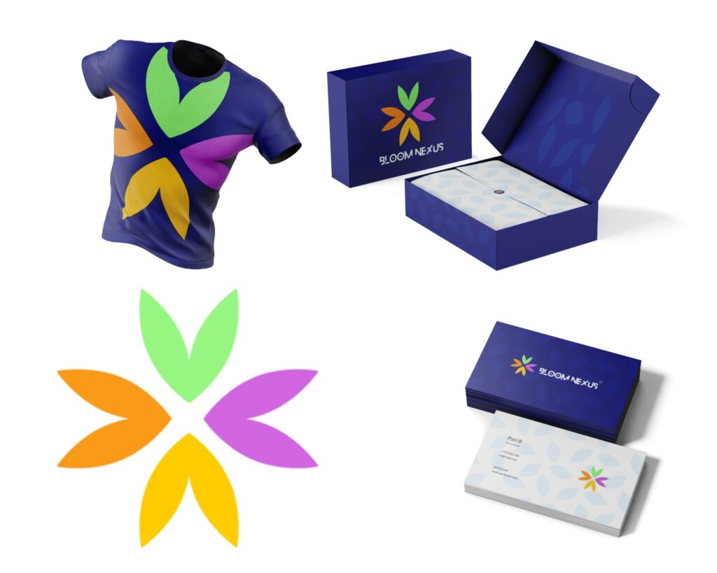
- Social media profiles and banners
- Business cards
- Packaging and merchandise
Variations
Create different versions of your logo, such as a full logo, a symbol-only version, and a wordmark-only version. This ensures you have options for various platforms and uses.
Step 7: Develop Brand Guidelines
To maintain consistency across channels, create a set of brand guidelines that include:
- Logo usage rules
- Color palettes
- Typography
- Example applications
Conclusion
Designing a logo is a creative journey that requires research, experimentation, and refinement. By following these steps, you can create a logo that effectively represents your brand and resonates with your audience. Ready to get started? Let your creativity shine!
FAQs
How do I design my own logo? Designing a logo is achievable with tools like Looka’s logo maker. You don’t need advanced design skills—just a vision for your brand.
What are the three rules of good logo design?
- Simplicity: Ensure your logo is clear and easy to recognize.
- Memorability: Create a design that stands out and sticks in people’s minds.
- Versatility: Your logo should look great in any size or color.
What file types should I use for my logo? Save your logo as a vector file (SVG or EPS) for scalability. You can convert it to PNG or JPG for specific uses.
Ready to showcase your brand with a standout logo? Let us know how we can help you achieve your vision!
PariPixel Studio – Turning ideas into visuals that captivate!