In the world of graphic design, two fundamental principles—hierarchy and emphasis—are crucial in guiding a viewer’s attention and enhancing the overall effectiveness of your design. These elements ensure your message is communicated clearly and effectively, making your designs not just aesthetically pleasing, but also functional.
What is Hierarchy in Design?
Hierarchy in design refers to the arrangement or presentation of elements in a way that indicates their importance. It is about creating a visual order so the viewer knows where to look first, second, and so on. Hierarchy directs the viewer’s eye and helps them navigate the design in a logical sequence.
For example, when designing a website, the most important elements like the headline or call-to-action (CTA) button should be given more visual weight than less important information like the footer or secondary links.
How to Achieve Hierarchy:
- Size and Scale: Larger elements naturally attract more attention. Use size to highlight the most important items. For example, a large headline will grab attention before a smaller body text.
- Contrast: High contrast helps to create a focal point. Use contrasting colors, typography, or shapes to distinguish key elements from others.
- Position: The placement of elements can also influence their importance. Items placed at the top, center, or left of the page often stand out more than those placed at the bottom or edges.
- Whitespace: Leave space around important elements. Whitespace not only makes the design look cleaner but also helps the viewer focus on what truly matters.
Resources – www.flux-academy.com
What is Emphasis in Design?
While hierarchy deals with the overall arrangement of elements, emphasis focuses on drawing attention to a particular element within the design. It helps highlight a key message, feature, or product, making it stand out above all other elements.
For example, a call-to-action button should have emphasis to ensure users can easily spot it and take the desired action.
How to Achieve Emphasis:
- Color: Using a bold or contrasting color can make a specific element pop. A bright color on a dark background, for instance, can direct the viewer’s eye immediately to that element.
- Typography: Play with font size, weight, and style to make important words stand out. A larger, bolder font in your headline instantly catches attention.
- Images and Icons: A strategically placed image or icon can act as an emphasis point. For example, a large product image on an e-commerce site can instantly draw attention to that item.
- Movement: Adding subtle animations or hover effects can highlight key elements as they change on interaction. This creates a dynamic focal point that guides the viewer’s attention.
- Repetition: Repeating design elements like patterns or shapes can emphasize a point. For instance, a color used consistently across different sections of the design can reinforce its importance.
How to Combine Hierarchy and Emphasis for Maximum Impact
To create a truly effective design, you should combine both hierarchy and emphasis. Here’s how:
- Establish Clear Hierarchy First: Start by laying out your design in a way that naturally guides the viewer through the content in the correct order.
- Apply Emphasis to Key Elements: Once you’ve established hierarchy, use emphasis techniques to draw attention to the most crucial parts of your design—such as the primary message or call-to-action.
- Balance and Consistency: While you want certain elements to stand out, maintaining a sense of balance is key. Avoid overwhelming the viewer with too many emphasized elements. A clean, well-balanced design always works best.

Examples of Hierarchy & Emphasis in Action
- Website Design: Think of an e-commerce website where the product image is the focal point (emphasis), and the product details, reviews, and “Add to Cart” button are organised based on importance (hierarchy).
- Social Media Graphics: A social media post with a bold headline (emphasis), followed by smaller text for additional details (hierarchy). The CTA could be highlighted with a different color to catch the viewer’s eye.
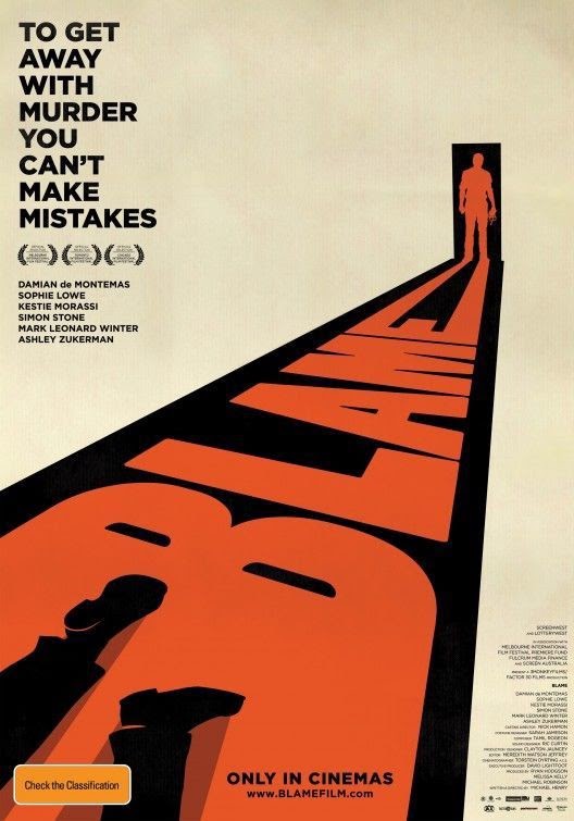
- Print Designs: In a flyer or poster, a sale headline might be bold and large (emphasis), with supporting information like the date or location in smaller, secondary text (hierarchy).
Resources to Dive Deeper
To further enhance your understanding of hierarchy and emphasis in design, check out the following resources:
- “The Principles of Design” by Canva:Canva Design School
- This article offers a detailed breakdown of design principles, including hierarchy and emphasis.
- This article offers a detailed breakdown of design principles, including hierarchy and emphasis.
- “Designing Visual Hierarchy” on Smashing Magazine:Smashing Magazine
- This guide dives deep into the mechanics of creating a strong visual hierarchy and how to use it to guide users.
- This guide dives deep into the mechanics of creating a strong visual hierarchy and how to use it to guide users.
- “Visual Hierarchy in Web Design” by HubSpot:HubSpot
- Learn how to design a website with visual hierarchy in mind, ensuring users can easily find and engage with key content.
- Learn how to design a website with visual hierarchy in mind, ensuring users can easily find and engage with key content.
- Adobe’s Graphic Design Tutorials:Adobe Learn
- A treasure trove of tutorials to help you master design principles like hierarchy and emphasis in tools like Illustrator, Photoshop, and InDesign.
By mastering hierarchy and emphasis, you can take your designs to the next level, ensuring they not only look good but also serve their intended purpose effectively. Whether you’re designing for print, web, or social media, these principles are essential for creating engaging, user-friendly designs.
For more tips and resources, stay connected with us at PARIPIXEL.COM.

keep up the fantastic work, I read few blog posts on this website and I think that your website is rattling interesting and has sets of good information.