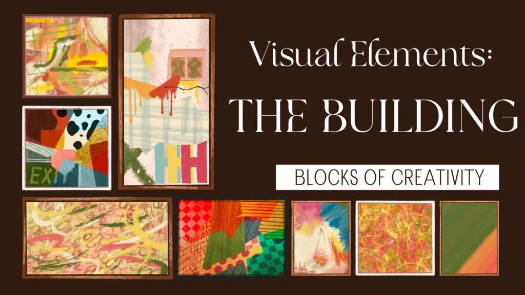
Every powerful design starts with strong visual elements. These elements are the foundation that shapes how a design looks, feels, and communicates. Whether you’re creating a brand identity, a website, or a social media post, visual elements determine how your message is perceived before a single word is read.
At PariPixel, we believe that great design is not about decoration—it’s about intentional visual choices that guide, influence, and connect with people.

What Are Visual Elements?
Visual elements are the core components designers use to create meaning, structure, and emotional impact. When used strategically, they transform ideas into compelling visual experiences.
Let’s break down each element in detail.
1. Color: The Language of Emotion
Color is one of the most powerful tools in design. It instantly sets the mood and influences how people feel about a brand or message.
How Color Works in Design
- Evokes emotions (red = energy, blue = trust, green = growth)
- Creates brand recognition
- Guides attention and hierarchy
- Influences decision-making
For example, tech brands often use blue to convey trust and reliability, while creative brands lean toward bold or playful palettes to express originality.
Best Practices
- Use a limited, consistent color palette
- Maintain strong contrast for readability
- Consider cultural meanings of colors
- Use accent colors to highlight key actions
Image Suggestion
AI Prompt:
Modern color palette board with swatches, gradients, and color psychology notes, clean graphic design style, soft lighting, high resolution
Resources
- Adobe Color Theory Guide
https://www.adobe.com/creativecloud/design/discover/color-theory.html - Color Psychology Explained
https://www.verywellmind.com/color-psychology-2795824
2. Typography: Giving Words a Personality
Typography is more than choosing fonts—it’s how text speaks visually.
Why Typography Matters
- Communicates brand tone (formal, playful, modern)
- Improves readability and accessibility
- Creates visual hierarchy
- Builds consistency across platforms
A luxury brand may use elegant serif fonts, while a startup might choose clean sans-serif typefaces to feel modern and approachable.
Typography Tips
- Limit font families (2–3 max)
- Use hierarchy (headings, subheadings, body text)
- Maintain proper line spacing
- Ensure readability across devices
Image Suggestion
AI Prompt:
Typography layout sheet showing different font styles, headings, body text, spacing and hierarchy, minimalist editorial design
Resources
- Google Fonts Knowledge
https://fonts.google.com/knowledge - Canva Typography Guide
https://www.canva.com/learn/typography/
3. Images & Icons: Visual Storytelling Tools
Images and icons help communicate ideas faster than text. They add emotion, clarity, and context.
How Imagery Enhances Design
- Tells stories instantly
- Makes content relatable
- Improves engagement
- Reinforces brand identity
Icons simplify complex ideas, while images create emotional connections. Together, they guide users intuitively.
Best Practices
- Use high-quality, consistent visuals
- Avoid generic stock photos
- Maintain a unified icon style
- Optimize images for performance
Image Suggestion
AI Prompt:
Modern website mockup featuring custom icons and lifestyle imagery, clean UI design, storytelling visuals, professional look
Resources
- Material Design Icons
https://m3.material.io/styles/icons - Unsplash (High-quality imagery)
https://unsplash.com/
4. Lines & Shapes: Creating Structure and Flow
Lines and shapes define layout, organize content, and guide the viewer’s eye.
Role of Lines & Shapes
- Create visual paths
- Separate sections
- Add movement and rhythm
- Establish brand personality
Geometric shapes feel modern and structured, while organic shapes feel natural and friendly.
Design Tips
- Use shapes consistently
- Avoid visual clutter
- Let lines guide attention naturally
- Balance sharp and soft elements
Image Suggestion
AI Prompt:
Abstract design composition using geometric shapes and lines, modern layout, balanced spacing, minimal style
Resources
- Gestalt Principles of Design
https://www.interaction-design.org/literature/topics/gestalt-principles - Canva Shape Design Guide
https://www.canva.com/learn/shapes/
5. White Space: The Power of Simplicity
White space (or negative space) is the empty area between design elements. It’s not wasted space—it’s a design tool.
Why White Space Matters
- Improves readability
- Highlights important elements
- Creates elegance and focus
- Reduces cognitive overload
Minimalist designs rely heavily on white space to communicate clarity and confidence.
Best Practices
- Don’t overcrowd layouts
- Let content breathe
- Use spacing to show relationships
- Balance content and empty areas
Image Suggestion
AI Prompt:
Minimalist web layout with strong white space, clean typography, elegant spacing, modern design aesthetic
Resources
- Nielsen Norman Group – White Space
https://www.nngroup.com/articles/white-space/ - Smashing Magazine – Negative Space
https://www.smashingmagazine.com/
Why Visual Elements Matter in Design
Strong visual elements help:
- Capture attention instantly
- Strengthen brand identity
- Improve communication clarity
- Create emotional connections
- Build trust and credibility
Good design isn’t accidental—it’s deliberate visual decision-making.
At PariPixel, we use visual elements strategically to ensure every design not only looks good but works effectively.
Final Thoughts
Understanding visual elements is essential for designers, brands, and businesses alike. When color, typography, imagery, shapes, and white space work together, design becomes more than visuals—it becomes experience.
If you’re building a brand or refining your visual identity, mastering these elements is the first step toward impactful design.
👉 Ready to design your brand identity? Explore our services at PariPixel.com


